DETHAR | Brand Identity

Watheera is a prayer-wear brand designing dedicated prayer sets for Muslim women — hijabi and non-hijabi — who need something ready to pray in without improvising.
The Challenge
The Challenge
The Challenge
Every touchpoint in this category speaks the same way: transactional, discount-first, indistinguishable from one seller to the next. The challenge wasn't finding a gap in supply — it was building a brand with enough of a point of view that a woman would recognize it, trust it, and come back to it, in a category where almost nobody bothers to try.
The Strategy
The Challenge
The Challenge
The strategy was built around six defined values rather than a single tagline: comfort over performance, care over transaction, accessibility over exclusivity, ease over friction, quiet confidence over noise, authenticity over performance. Together they positioned Watheera as accessible mid-range — priced to be reached for often, not saved for occasions — sitting between generic discount sellers and a fully premium tier without trying to be either. The name itself does real work here: وثيرة means soft and plush, and the phrase behind it, ثوب تُجلَّل به الثياب فيعلوها, describes a garment draped over your clothes so it rises above them — language that gave the whole brand its central metaphor before a single color was chosen.
The Identity
The Challenge
The Touchpoints
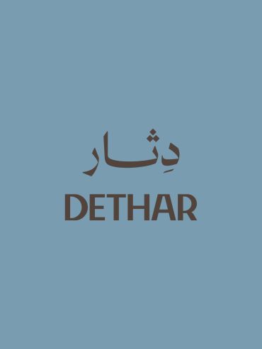
The palette is a fixed five-color system with defined usage proportions rather than a loose mood board — sage dominant at roughly a third of any composition, terracotta and dusty pink as support, cream for background space, tan reserved for the smallest accents only. That discipline was intentional: a brand built on "quiet confidence" needed a palette with real hierarchy, not five colors competing for attention. The bilingual wordmark nests a compact WATHEERA lockup inside the full Arabic وثيرة mark, with defined clear-space rules and a secondary logo variation for smaller applications — legible and calm rather than ornamental.
The Touchpoints
The Touchpoints
The Touchpoints
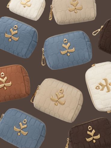
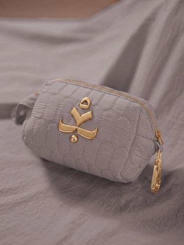
Packaging carries the same restraint as the mark. A soft pouch with debossed or foil-stamped hardware holds the prayer set before it reaches the delivery bag. A companion thank-you card extends the idea of care-over-transaction into something functional: the front holds the wordmark and a soft-spoken note, the back carries دعاء الصلاة, turning what's usually a throwaway insert into something she actually keeps in the pouch and reaches for again.
Art Direction
The Touchpoints
Launch Approach
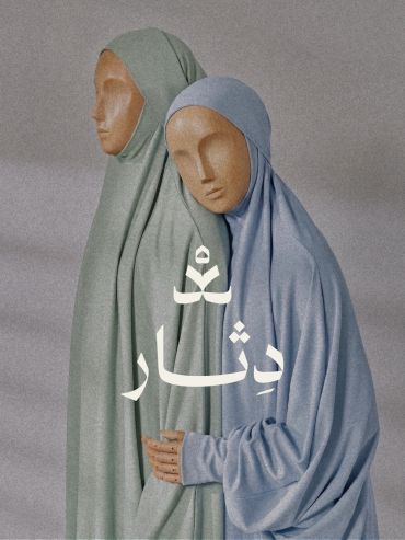
A full photography system was developed to keep the "authenticity, not performance" value consistent across every asset — minimalist racks, macro shots of woven labels, folded texture shots against raw stone, and abstract wooden mannequin figures that show fabric drape without ever showing a model's face. Each concept was built as a reusable, adjustable prompt across both portrait and landscape formats, so the same visual restraint holds whether it's a product page or a Reel.
Launch Approach
The Touchpoints
Launch Approach
Prelaunch content followed the brand's own tone rule — no urgency language, no discount framing — sequencing the name's meaning first, then fabric and packaging craft, then the first product reveal paired with early access for a waiting list, closing on launch day without a single exclamation mark in the copy.
The Scope
The Scope
The Scope
Brand strategy, brand identity, logo design, color system with defined usage rules, bilingual typography, packaging and hardware application, thank-you card design, product photography art direction, prelaunch content strategy.


Copyright © 2024 Habiba.psd - All Rights Reserved.
This website uses cookies.
We use cookies to analyze website traffic and optimize your website experience. By accepting our use of cookies, your data will be aggregated with all other user data.
