DETHAR | Brand Identity

DETHAR is a prayer-wear brand offering dedicated prayer sets - skirt and gown - for Muslim women who aren't already dressed to pray, whether hijabi or not.
The Challenge
The Challenge
The Challenge
The brief was simple on the surface: dusty, warm, feminine colors, bilingual Arabic and English identity. But the real challenge was positioning — this category is dominated by generic, discount-driven e-commerce sellers with no real identity to attach to. The name itself, دثار (a cloak, a wrap), carried meaning that most competitors' names didn't — the identity needed to actually use that meaning instead of treating the name as decoration.
The Strategy
The Challenge
The Challenge
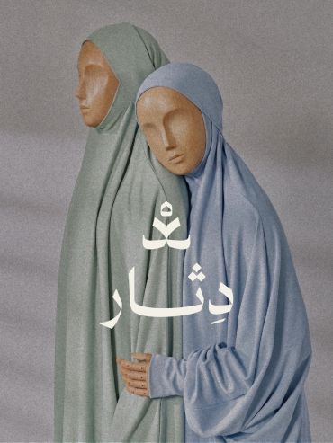
The direction was built around one idea: held, not just covered. Most prayer-wear brands sell coverage as a functional checkbox. Dethar was positioned around comfort and care instead — a set that feels chosen for her, not assigned to her. This shaped everything downstream: a warm, friendly personality, soft-spoken tone, and a visual identity that needed to feel like something you'd want wrapped around you, not just modest fabric.
The Identity
The Challenge
The Touchpoints
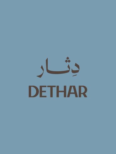
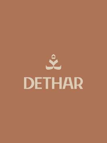
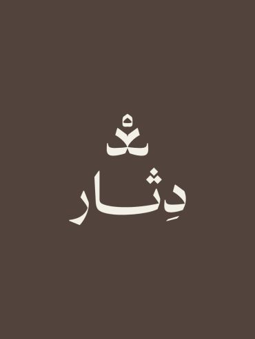
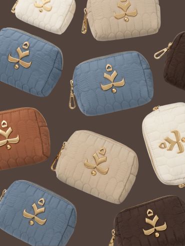
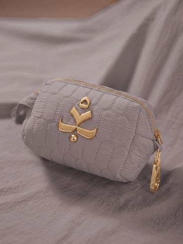
The core idea was to let the name design the mark. Instead of adding a separate icon next to the wordmark, we extended the Arabic letter د (the first letter of دثار) so its natural hook-shaped curve reads as a hood-to-shoulder drape—tight at the top like a hood peak, widening asymmetrically at the bottom like fabric settling over shoulders. No literal figure, no face — the letterform itself carries the "woman wrapped in a cloak" idea. This let the mark double as a standalone icon at small sizes: hardware on the pouch, a lockup on packaging, an app-icon-ready symbol.
The palette moved across dusty, warm tones — muted blue, sage green, terracotta, taupe, brown — feminine without leaning saturated or cold. The wordmark pairs a bilingual Arabic/English lockup, kept quiet and legible rather than ornamental.
The Touchpoints
The Touchpoints
The Touchpoints
The mark was translated into gold hardware on a quilted pouch — the piece that holds the prayer gown before it goes into the delivery bag. Shown across the full dusty palette (blue, taupe, terracotta, ivory, brown), the hardware becomes the brand's most-touched physical moment: what she actually holds and unzips before she prays.
The Scope
The Touchpoints
The Scope
Brand identity, logo design, color system, bilingual wordmark, packaging/hardware application.
Copyright © 2024 Habiba.psd - All Rights Reserved.
This website uses cookies.
We use cookies to analyze website traffic and optimize your website experience. By accepting our use of cookies, your data will be aggregated with all other user data.
